Building a Microsoft Power BI web app with an interactive visualization
I wanted to
provide a simple, neat guide for starters to get hands-on MS Power BI
and execute a dataset using the visualization in Power BI. Here is an
approach I came up with today, using simple tools and methods.
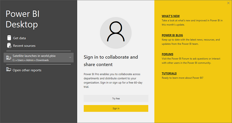
For Windows devices: Go to the Microsoft application store and get Power BI desktop

Download and launch it in your system
You might see this dialog box opened. We need to select Get data option here, and navigate to the dataset downloaded. But before that, we need to download a dataset to explore with Power BI. Once we download the dataset, we can come back to this step.
I wanted to test on a World Satellite dataset. Union of Concerned Scientists
provides a very nice and clean dataset in all formats : excel/csv/text
file for all satellite launches. So I went on to download some datasets
from their website with the following link (a website screenshot is
provided, just in case) Download the excel format database from this.

Once you have downloaded it, you can go on to the Get Data step in the Power BI window and navigate to downloaded satellite excel dataset.

Then select Sheet 1 of the same dataset and click Load.
This is what you might see, once Windows finishes loading the dataset:
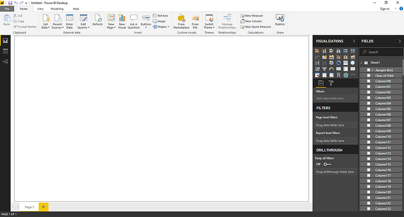
So on the right are Visualizations and Fields columns. Visualizations column has a list of icons corresponding to various graphs you
can obtain, while Fields column shows the column lists from the excel
datasheet such as Date of Launch, Launch Site, Purpose, Source, etc.
To come up with a simple yet powerful story from this data, I shortlisted some important list of correlated features, such as Country, Launch Vehicle and Expected lifetime.
Now comes the challenge of selecting the correct visualization and then
placing these selected fields in respective places, under a selected
visualization.
So
from the various map-based visualizations, I found the ArcGIS Maps as
the coolest one to showcase this dataset on. So we select the ArcGIS
graph icon from the Visualizations column.
Now we have to arrange the fields according to the chosen visualization. For example, from Fields, select Country — and then drag and drop this feature in the Location space, under the visualization column. Then choose the Launch Vehicle Field from Fields column and drag and drop the same in the Color space.
Then once dropped, click on launch vehicle tab again and select Count, that will set up the use of the total number of counts of launch vehicles for each country.
Then,
for showing more information, we can add the average lifetime expected
for satellites, for each country. We do this by selecting Expected Lifetime from fields column and dropping it in Tooltips space under visualization. The clicking on expected lifetime tab and selecting Average as the operational value to be integrated with the rest of the map.
Thus,
in a span of less than 10 minutes, we have evolved the simple satellite
launch excel file into a story told on a world map, about this world’s
current leading countries in terms of their might as a space power. We
can show the total number of launch vehicles, for the respective country
as well as the average life expectancy of their respective satellite’s
in space.

So
finally, you would have this beautiful world map view, with extra
information popping up when you hover your cursor over a
country — giving the Name of country, Total Launch vehicles and Expected
Lifetime.
While the intensity of color gives the idea about the number of launch vehicles for that country, we can easily visualize that, not surprisingly, the US, China and Russia have got the highest number of satellites launches to their credit.
While the intensity of color gives the idea about the number of launch vehicles for that country, we can easily visualize that, not surprisingly, the US, China and Russia have got the highest number of satellites launches to their credit.
You can use the focus mode to see the graph in the whole page, without any other graphs :

One
can also click on the top right corner to either export the data into
a .csv file or to see the data alongside the visualization or map
[select the switch to Horizontal layout view icon besides the More Options button on top-right corner] to see a screen as shown below.

One can play around with different buttons and zoom levels in the map to maybe have a more engaging infographic, as well.

I know you would use this for even more creative and interesting stuff, so eagerly waiting for your amazing responses.
Here
is an embedded code for the visualization. Click on it to open up a new
webpage to interact with the visualization created by me, for the
satellite dataset.
You can also do the same by Going to Files -> Click on Publish to web -> Embed code to your blog or html website

Following
is the website visualization of the dataset based on graphs and fields
selected in my report, it also changes in real time, as I change them on
my Power BI app dasahboard.
Power BI Report


I think you might also need the help of another important aspect of Power BI about which I am referring in this post.
ReplyDeletepowerbi read rest
This comment has been removed by the author.
ReplyDelete